


We’re uploading new templates every week
We’d like to send you infrequent emails with brief updates to let you know of the latest free templates. Is that okay?

Reset your Password
Please enter the email you registered with and we will send you a link to reset your password!
Check your email!
We’ve just sent you a link to . Please follow instructions from our email.


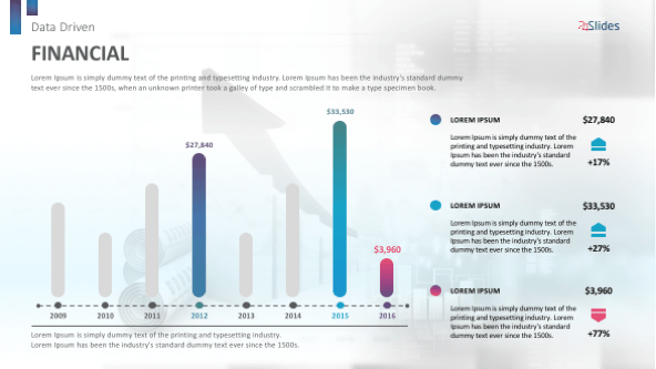
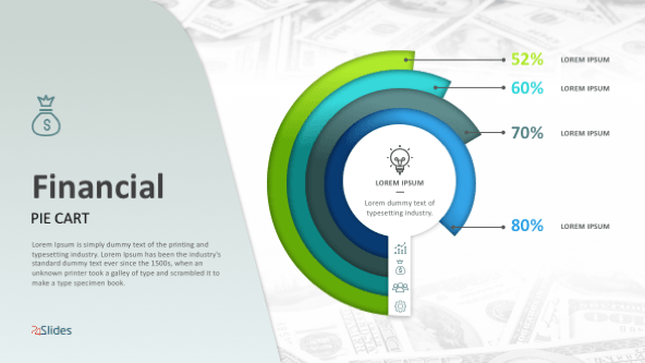
Dot charts or dot plots help you display the correlation between two numerical variables and make it easy for your audience to understand, compare and analyze quantitative information. As each dot represents an individual piece of data, this statistical tool works best with small and medium data sets. Our Dot Chart PowerPoint Template will enable your marketing, sales or finance department to deliver a powerful presentation using eye-catching graphics, a colorful dot matrix chart, icons to represent different categories and highlighted percentages.
Visualize how two variables are related to each other in a collection of simple yet effective dot charts that you can use to distribute numerical data as dots into its horizontal and vertical axes.
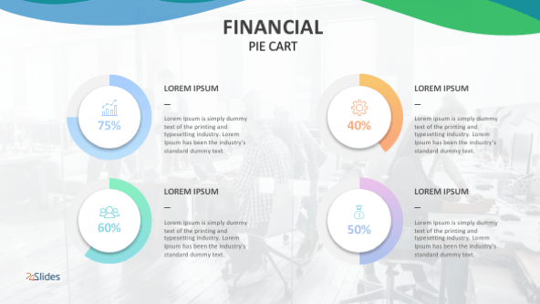
Work on our comparison slides to discover patterns or track the evolution of a process. This template gives you the option to display up to four dot charts at once and add large descriptions for each category represented. Try our world map graphic, business icons and bright dots to share your results in a creative way.
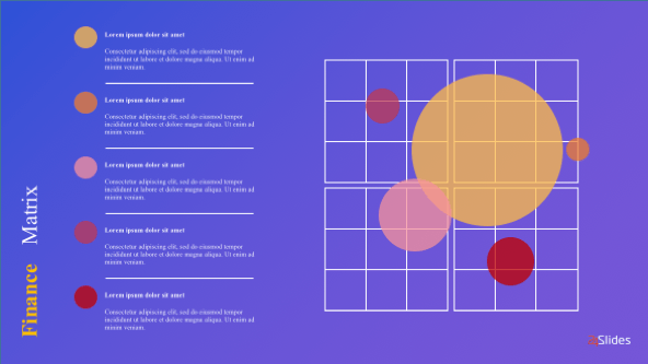
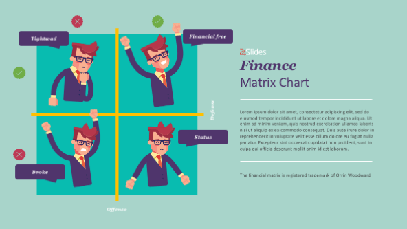
One of the most engaging data visualization tools. A Dot Matrix Chart shows your data arranged in a group of dots, which are divided by colors to obtain a quick overview of the distribution and proportions of each data category. Next to this matrix you will also find spaces to introduce percentages and a brief description.
Editable dots
If you want to add more data information to your charts, just change the color and size of each dot.
Detect trends
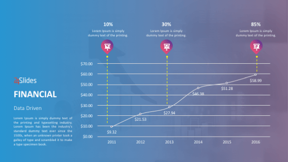
Connect dot plots by lines and detect new trends or identify patterns on your dot charts.
Easy comprehension
Dot charts rely heavily on colors to communicate quantitative datasets. This makes it easy for the audience to comprehend your results.


FIND OUT MORE ABOUT OUR CUSTOM DESIGN SERVICES
Check out other similar templates

 69 fully
editable
slides
69 fully
editable
slides


Todd Speranzo
VP of Marketing at Avella
"24Slides helps us get PowerPoints on-brand, and improve overall design in a timeframe that is often “overnight”. Leveraging the time zone change and their deep understanding of PowerPoint, our Marketing team has a partner in 24Slides that allows us to focus purely on slide content, leaving all of the design work to 24Slides."
Gretchen Ponts
Strata Research
"The key to the success with working with 24Slides has been the designers’ ability to revamp basic information on a slide into a dynamic yet clean and clear visual presentation coupled with the speed in which they do so. We do not work in an environment where time is on our side and the visual presentation is everything. In those regards, 24Slides has been invaluable."
Nyah Pham
Novozymes
"After training and testing, 24Slides quickly learnt how to implement our CVI, deliver at a high quality and provide a dedicated design team that always tries to accommodate our wishes in terms of design and deadlines."